Google Recipe
A recipe management application designed to fit into the Google apps suite, the result of a 2.5 hour UX Protothon.
2019
design
prototyping
A recipe management application designed to fit into the Google apps suite, the result of a 2.5 hour UX Protothon.
2019
design
prototyping
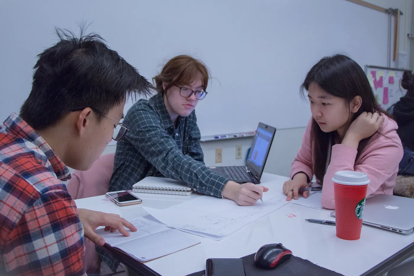
This project was done for the 5th annual UX Protothon hosted by UW Dubstech. This was a hackathon style challenge hosted by Google. They invited students of all majors to come test their rapid prototyping and design thinking skills in industry inspired, time-sensitive design challenges. Our challange was to protype what an app called Google Recipe could be. Me and two other participants formed a team, and only having two and a half hours for the whole process, quickly got to know one another and started on the challenge.
We started with identifying pain points we had experienced when using a smartphone to cook from.
From there we began brainstorming and sketching.
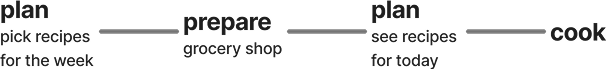
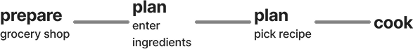
We determined there were two main types of user and wanted to make sure that the app design would function for both styles of meal planning and cooking.
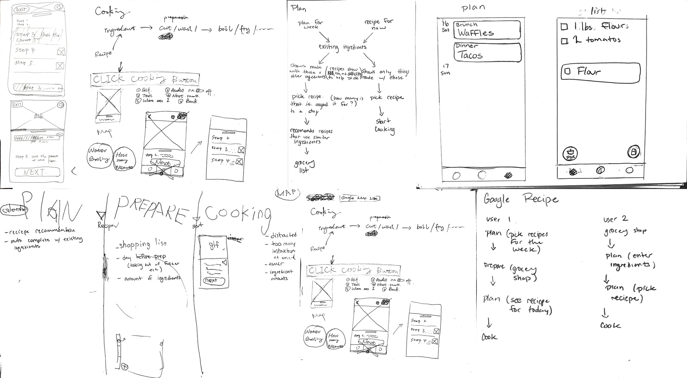
Due to the limited time of the protothon after brainstorming and sketching for about 20 minutes we got started on our mock ups. Pictured below are our mock-ups and details of all the screens we created, those with a * were the functions I focused on, working on mock-ups and details of user flow.
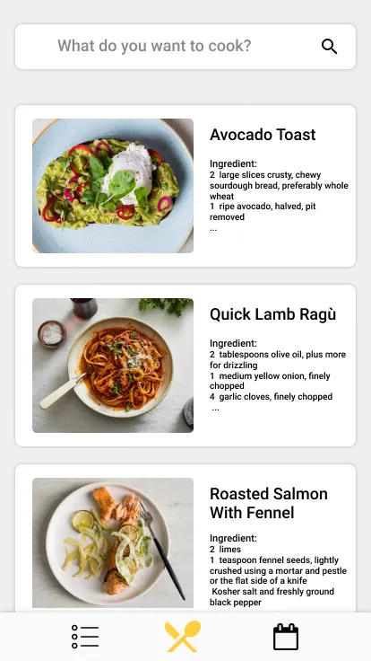
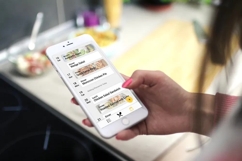
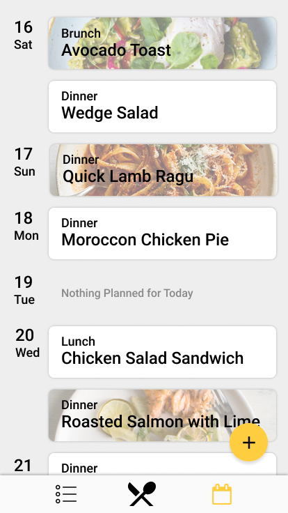
The home page shows a collection of recipes that are ready to cook with. This page displays recommended recipes for the user based on what they have in their fridge, what they have cooked in the past and popular recipes now. It also offers a search function.
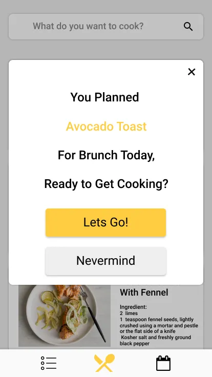
If a user has planned a recipe for that day, when they open the app they are greeted by a pop-up offering them a short cut directly to the recipe.
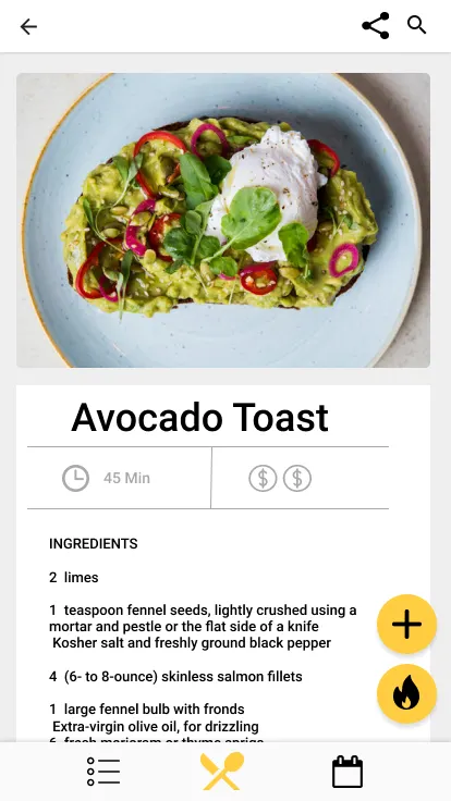
A brief text prompt of recipe showing the time it takes to prepare and the relative cost of ingredients. User can press the fire bottom to start cooking or press the plus button to add the recipe to their Meal Calendar.
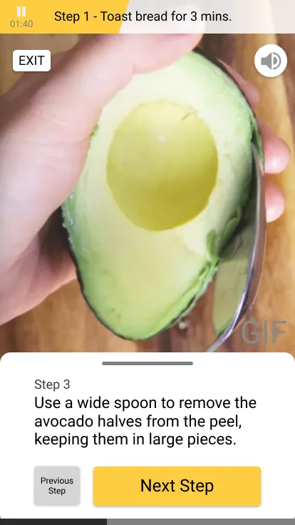
The step-by-step cooking page provides immersive instruction for users. We imagine the cooking process with a phone is like driving with google map, simple and less distracting. The screen is one of the steps. Basically, it consists of a gif of the current step, text, next step button, a timer of the previous step if needed, and audio instruction button. Users can also drag the bar to see all the steps.

This page allows for users to meal plan for their future. They can add recipes by searching from the home page or hitting the plus button. When meals are added to the calendar the ingredients needed for them are automatically added to the grocery list.
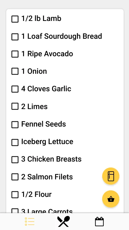
This page shows users what they need to purchase to make the recipes they have planned. By hitting the fridge icon they can add and see what they currently have in their fridge at home (the recipe search feature references this to show recipes for ingredients they have). By hitting the shopping basket a lock screen pop up is activated to allow for quick access to the shopping list while at the store.
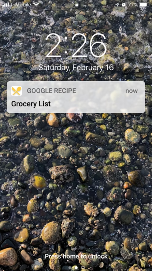
This is activated from the grocery list page to allow user quick access to their shopping list while at the store.
This project was an excellent practice in rapid iteration and fitting into an existing design suite.
Made in Collaboration with Tom Zou and Fan Lu